Hive Entertainment
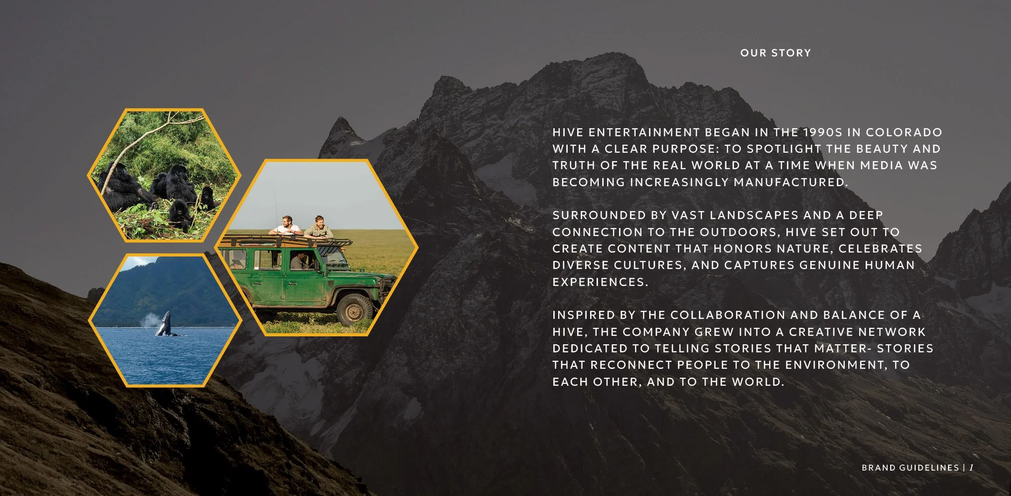
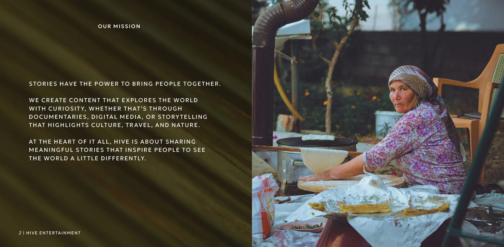
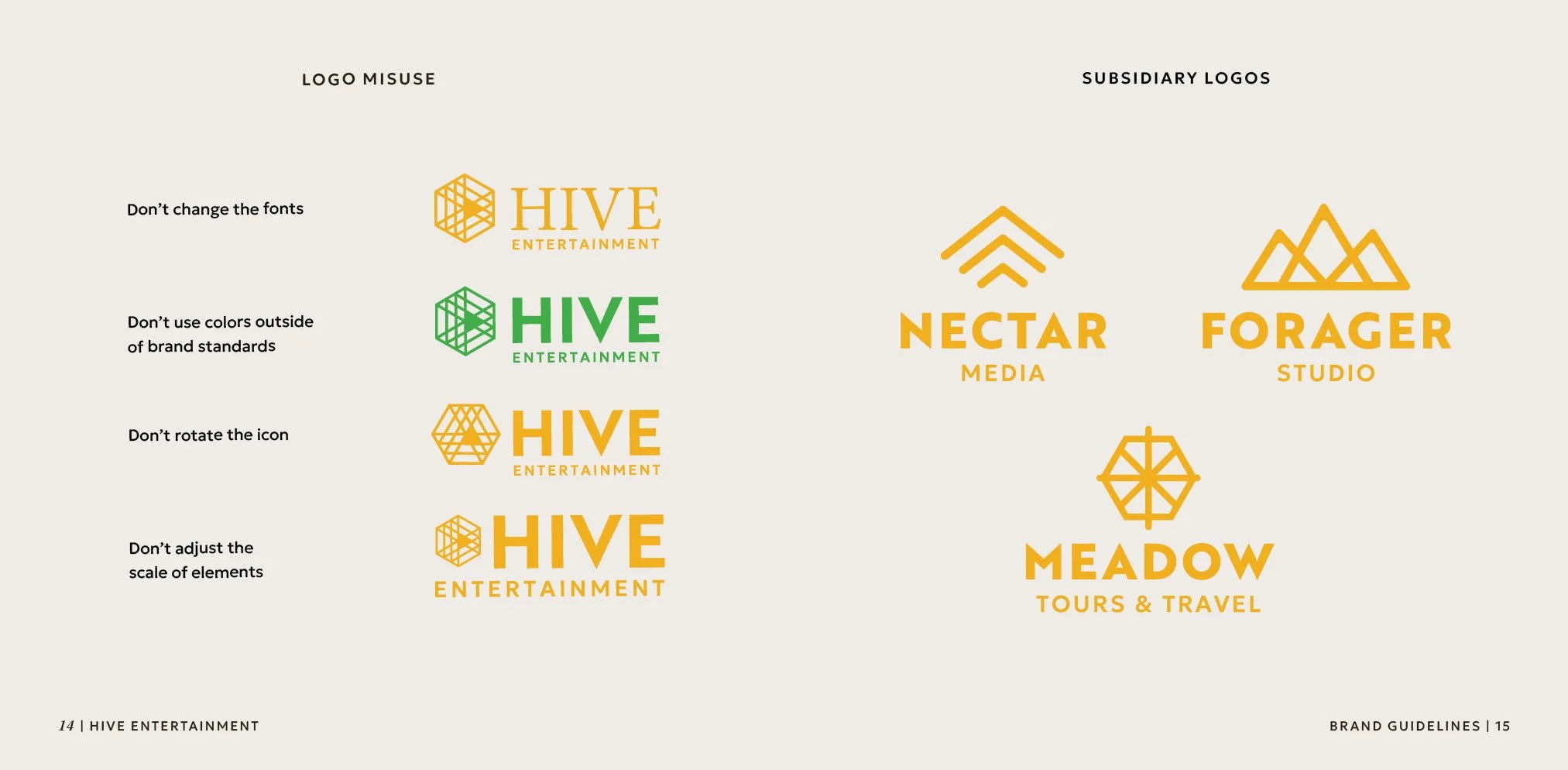
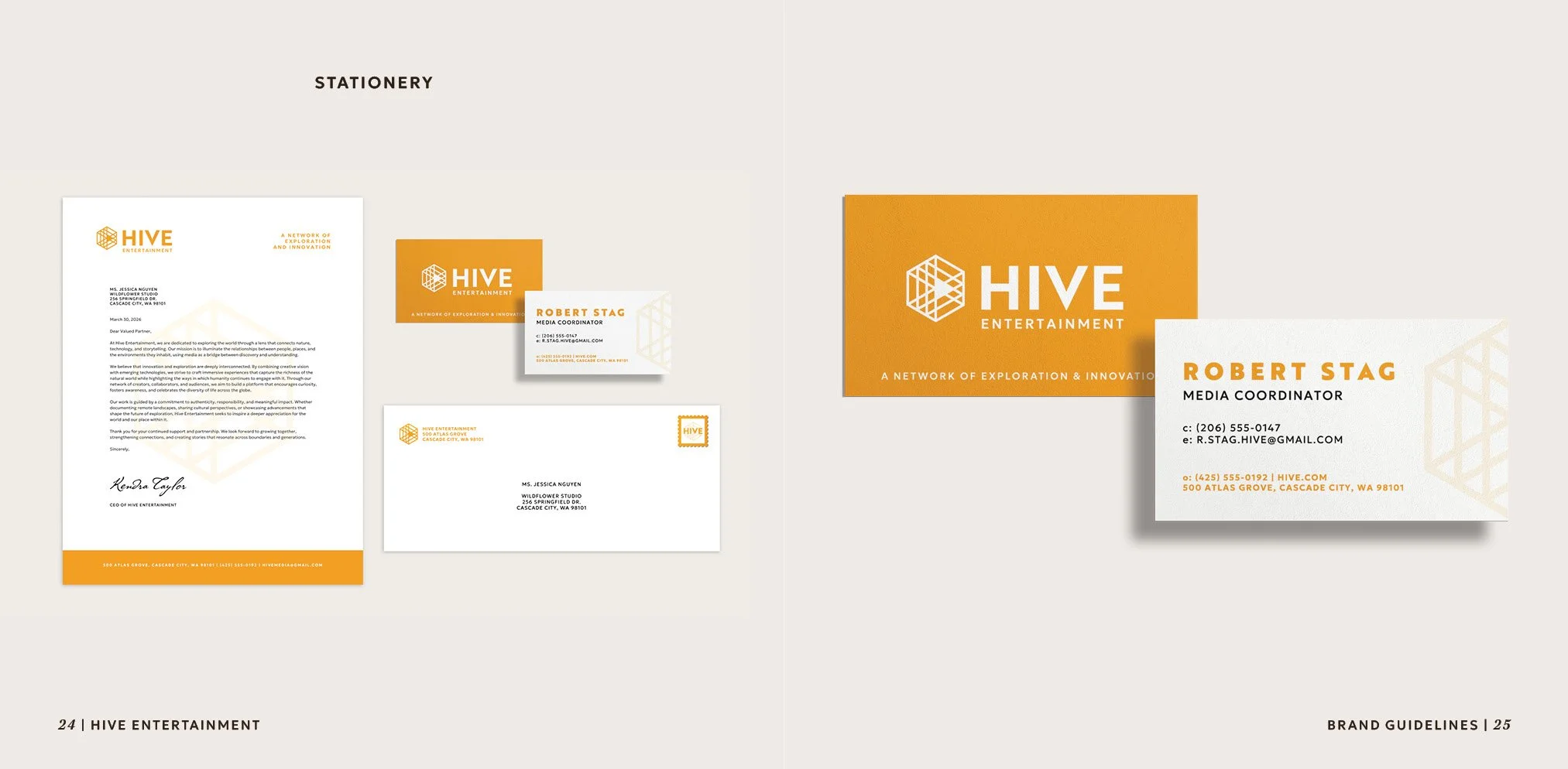
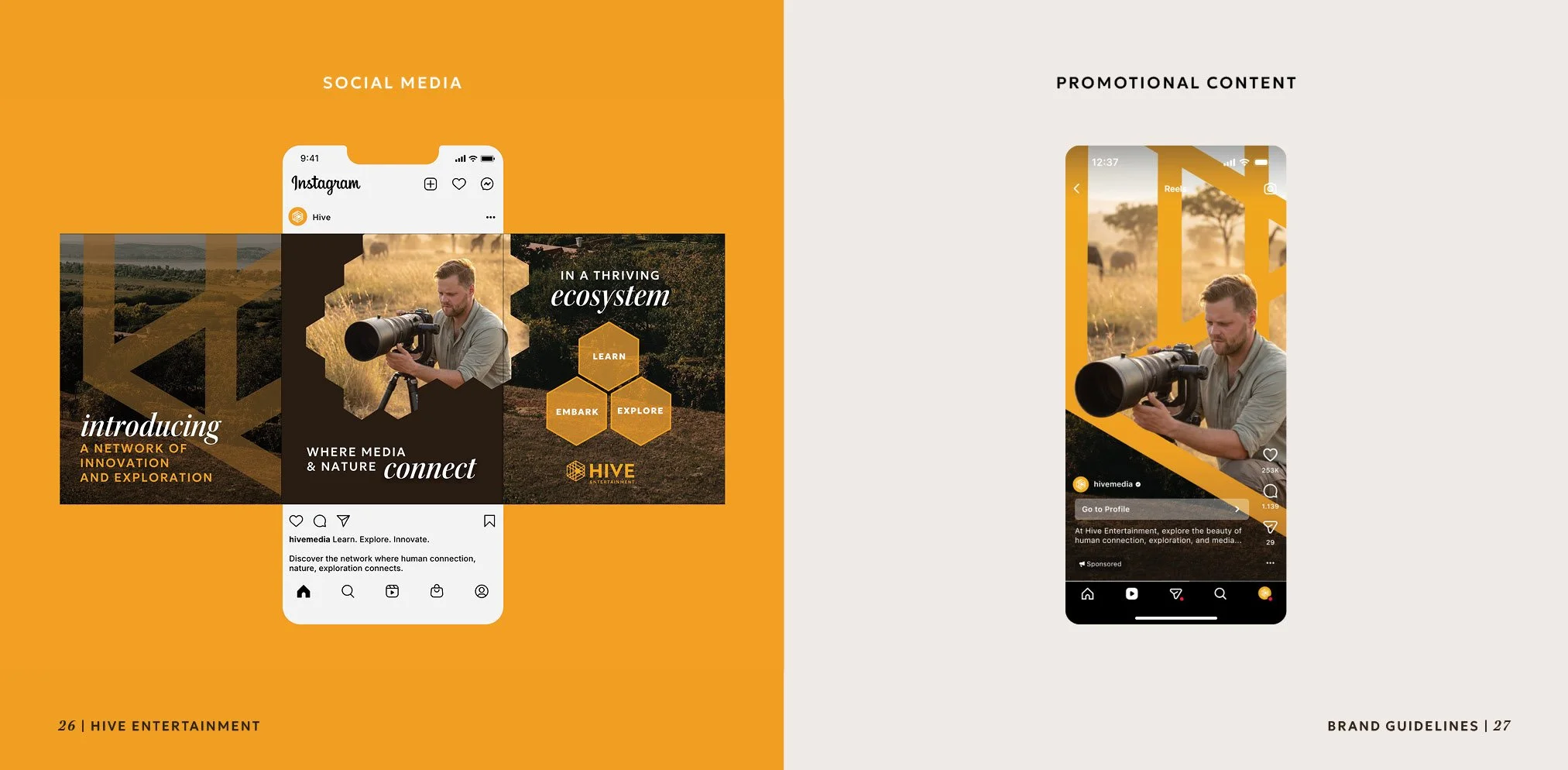
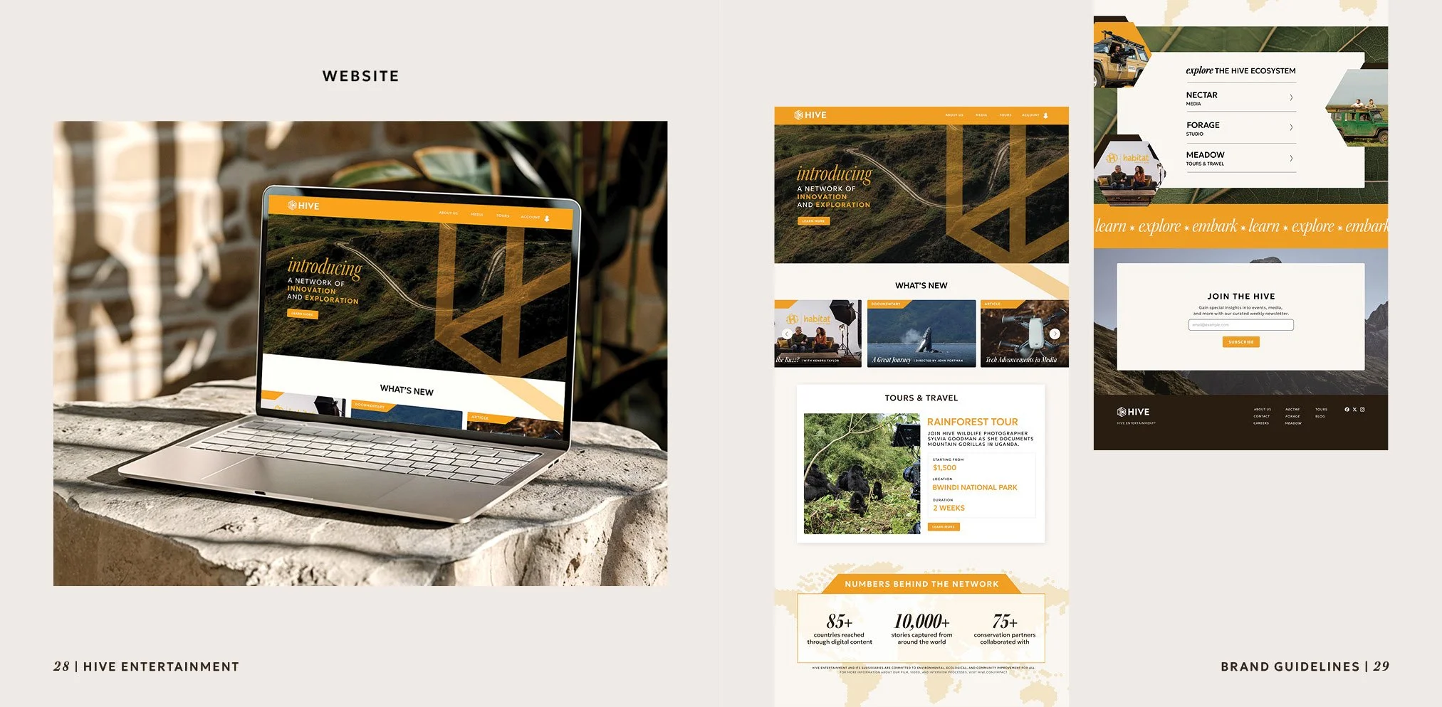
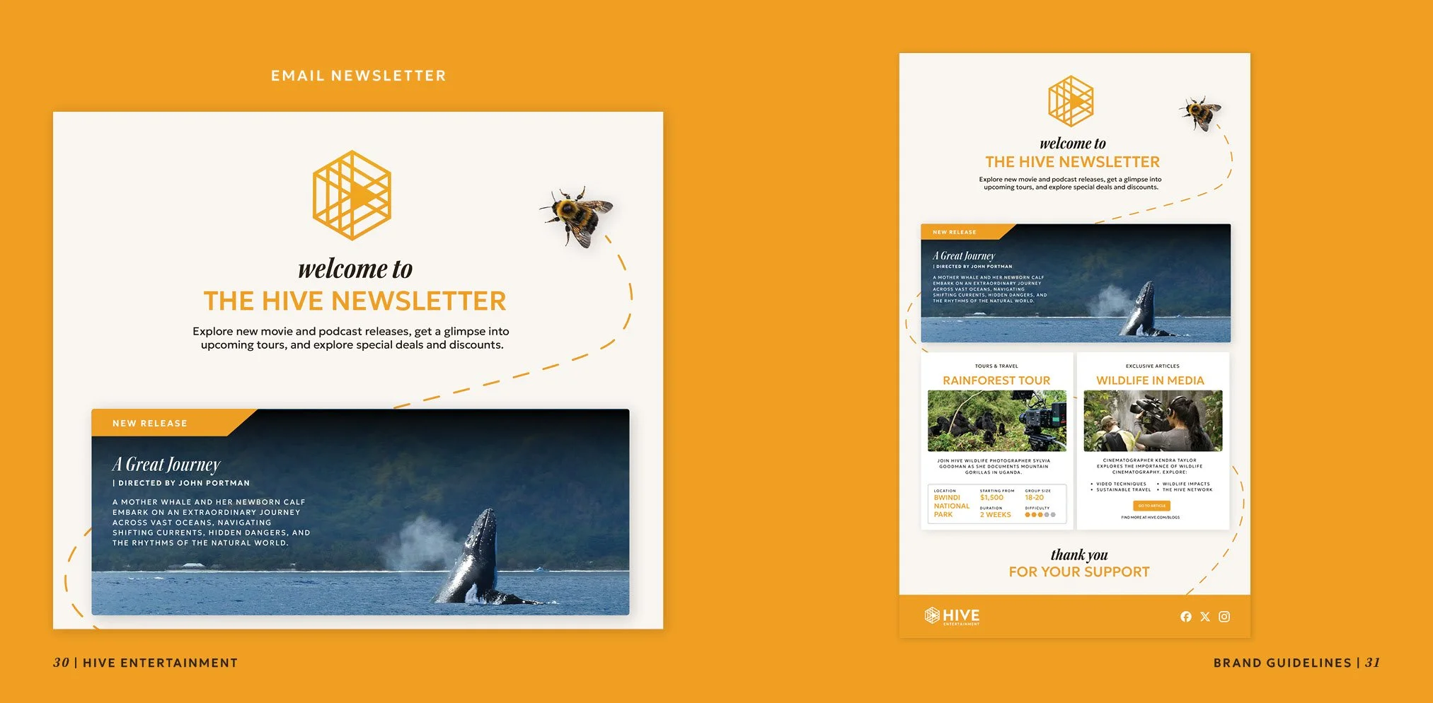
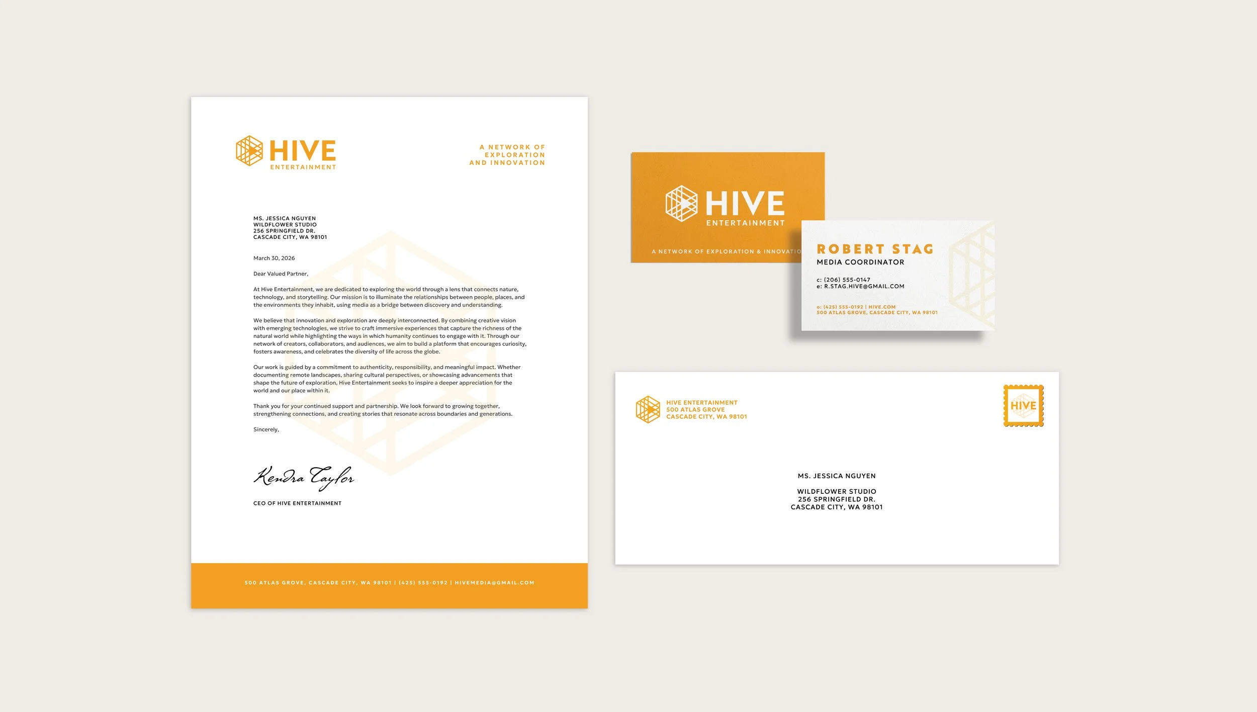
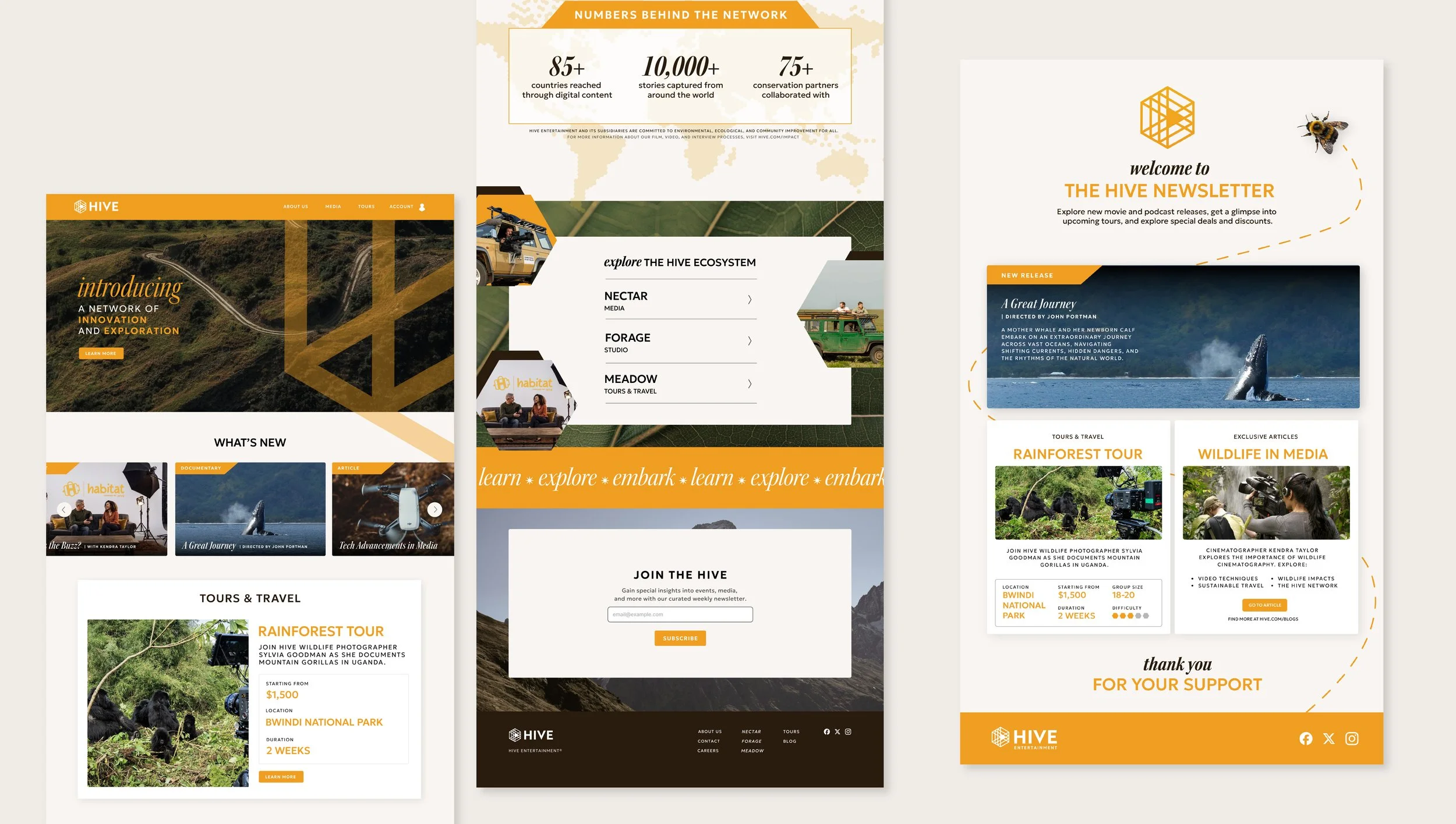
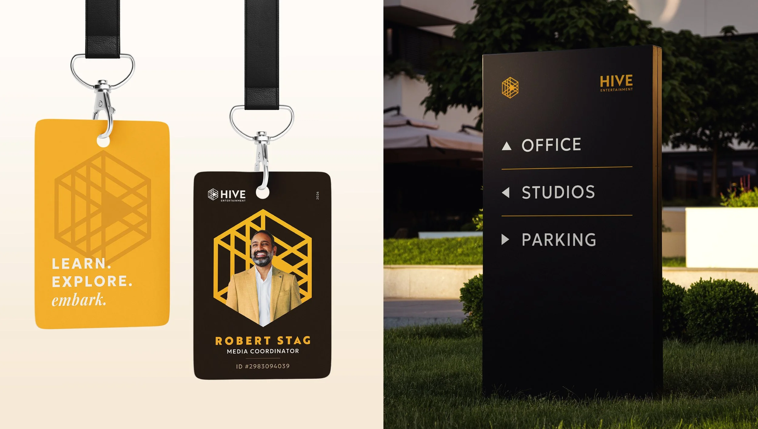
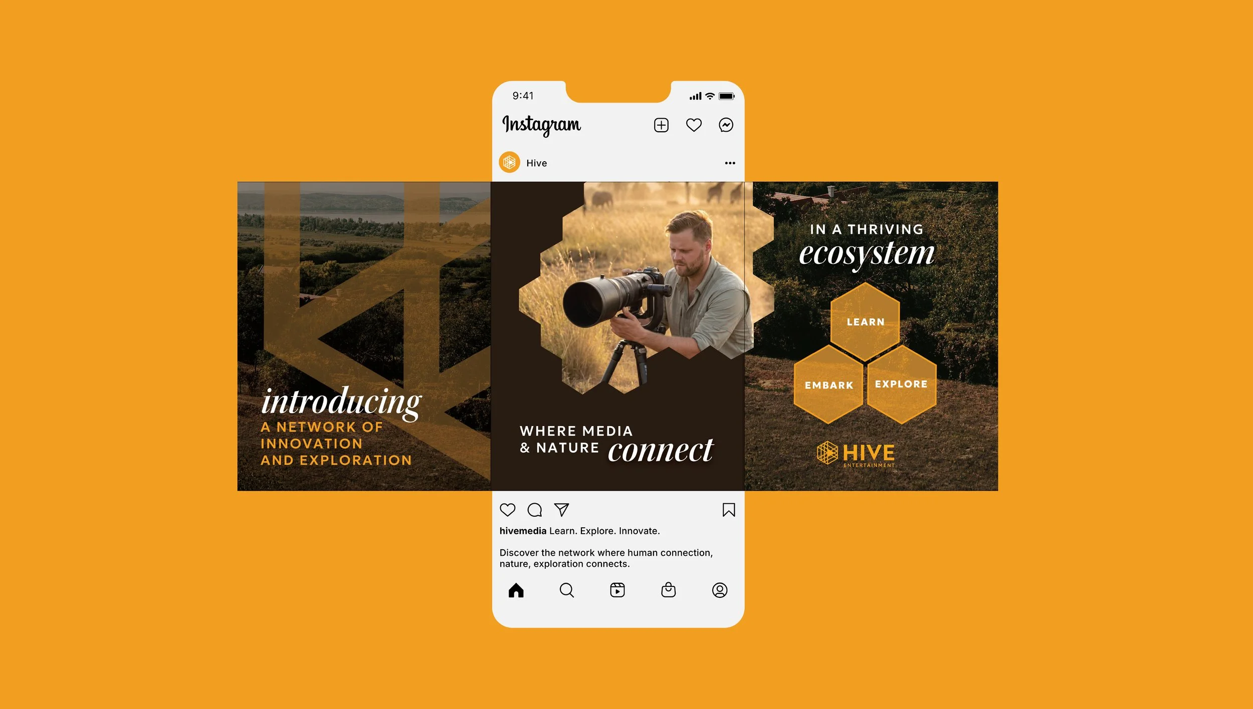
Hive Entertainment is a media company that is rooted in storytelling, human connection, and nature. Through documentaries, podcasts, and digital content, the company aims to spark curiosity and a deeper connection between people and the world around them. The design system is approachable, friendly, and consistent, drawing inspiration from the natural world while incorporating a structured UI and visual identity. This visual style carries over into the website, newsletter, social media, and other physical and digital brand extensions.
Client
Hive Entertainment
Year
2026
The Problem
How do we create a visual system that is both rooted in nature and technology?
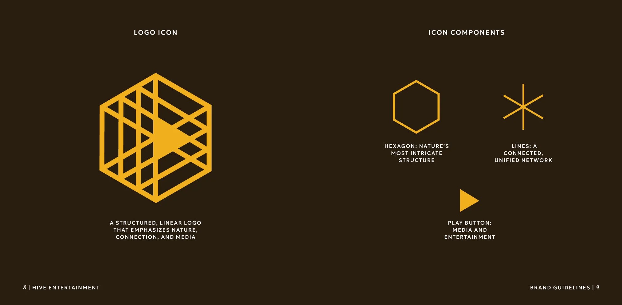
Traditionally, these visual signals are often contradictory: harsh angles of modern technology and organic, textured shapes of nature. Hive Entertainment seeks to combine both of these visual themes into one coherent brand guideline system.
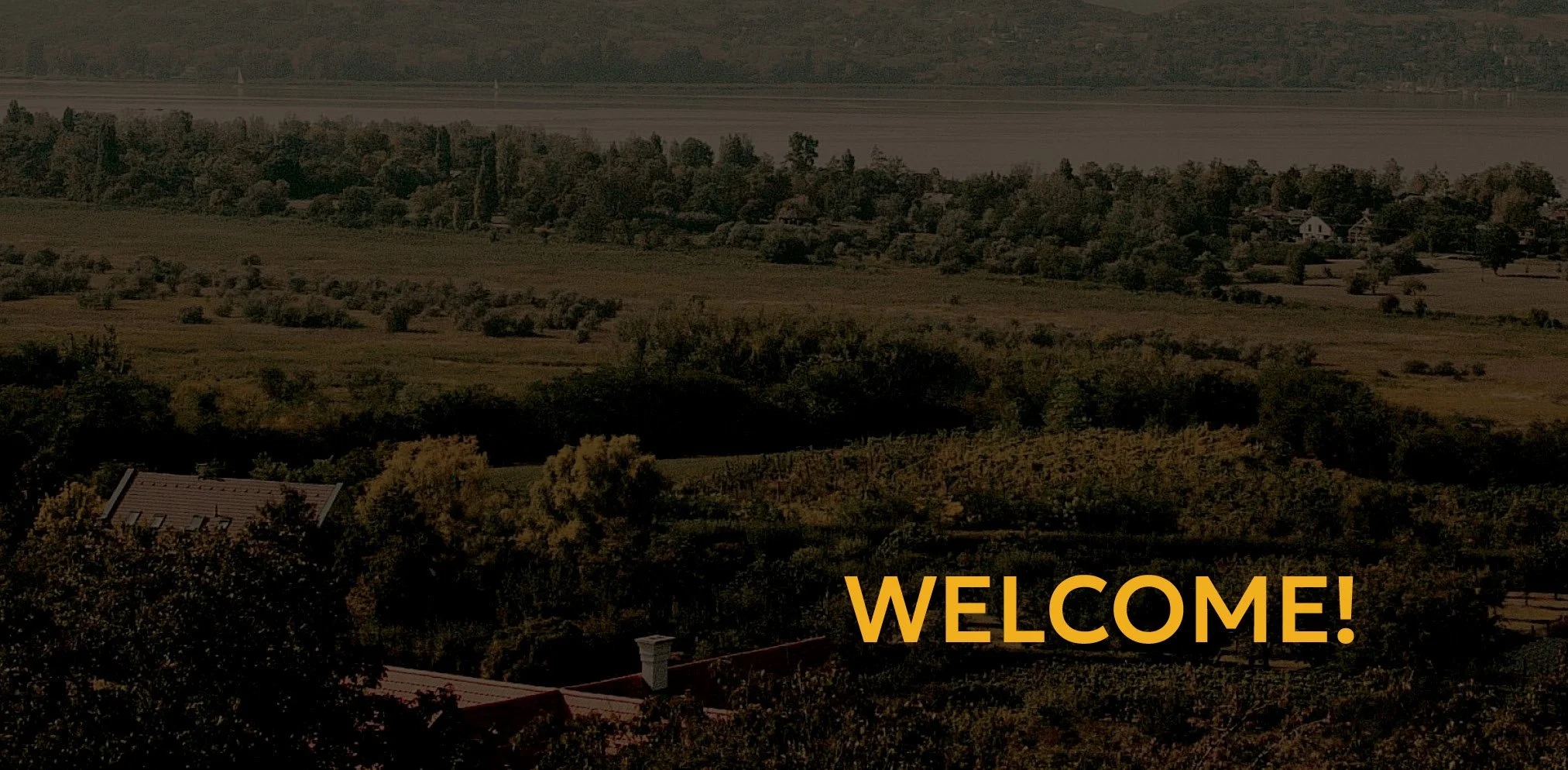
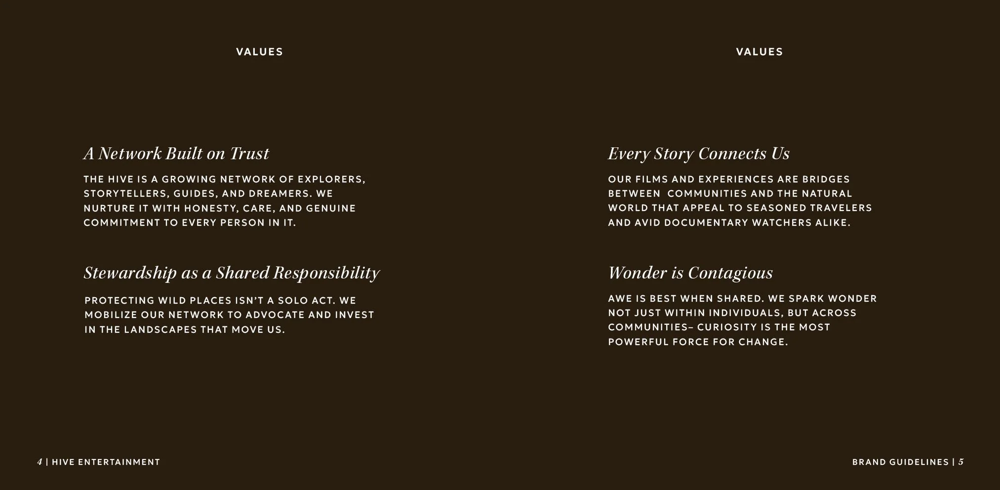
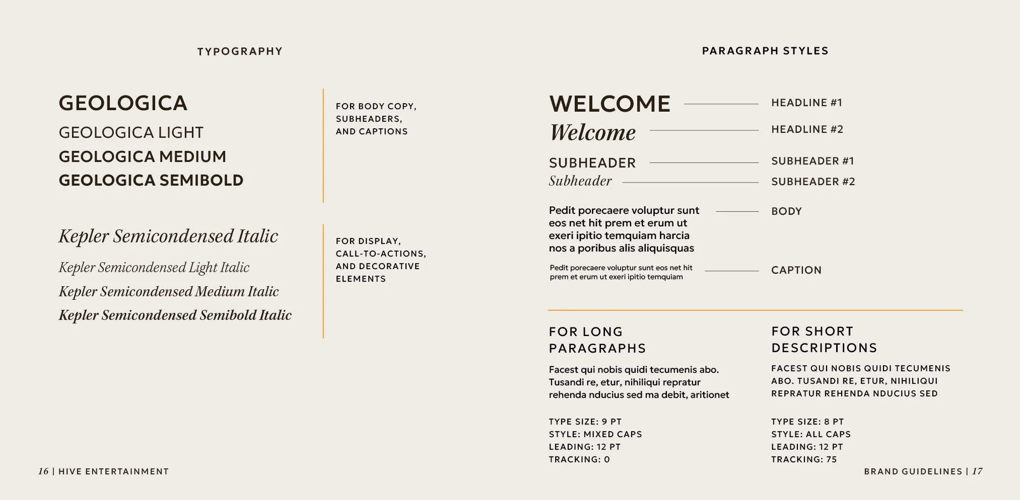
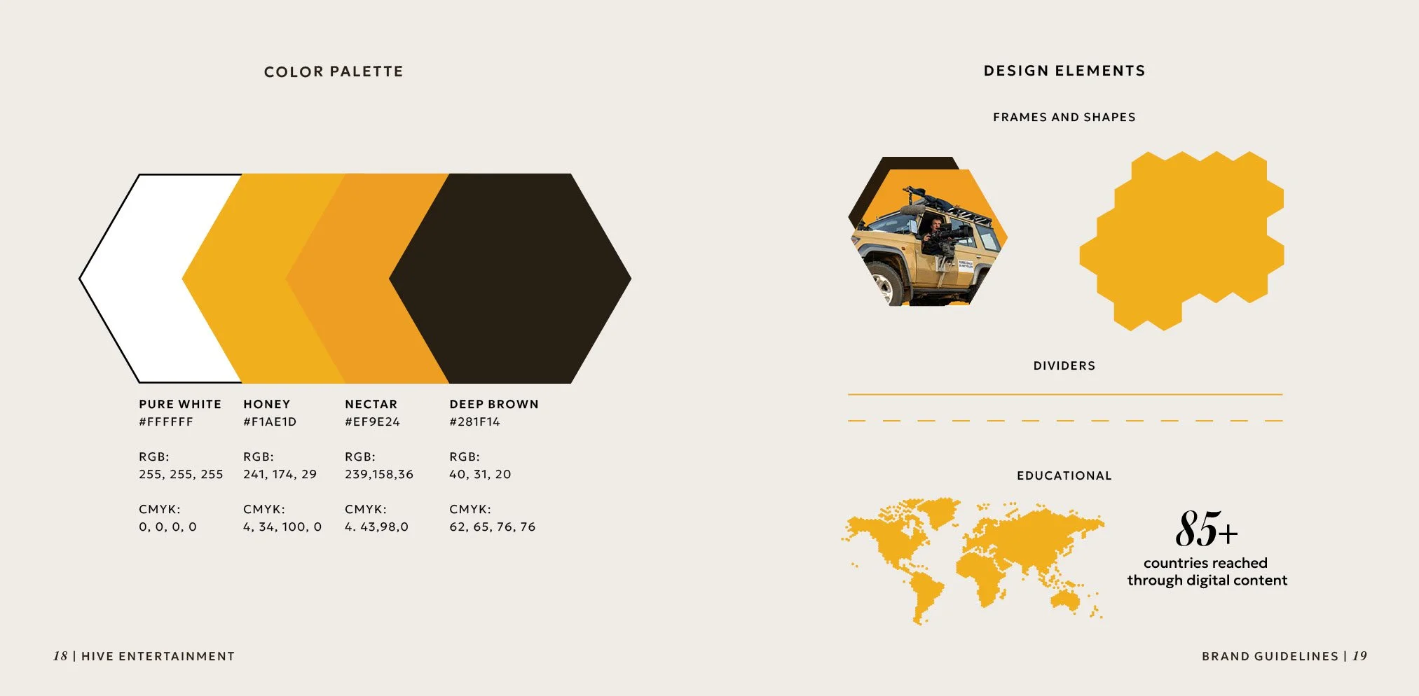
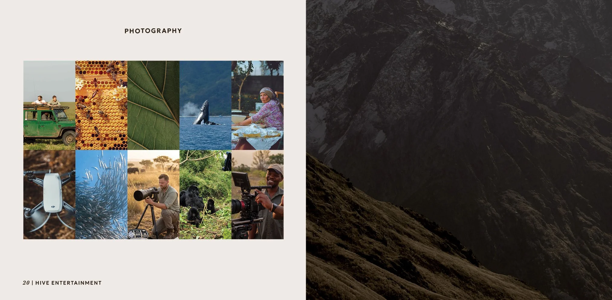
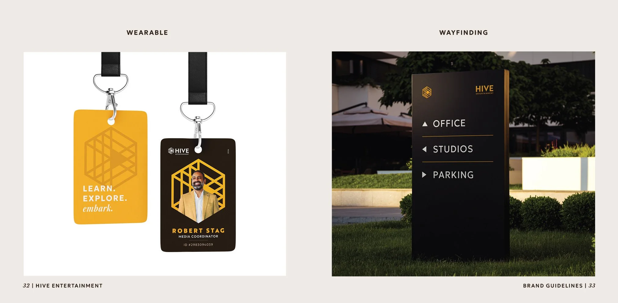
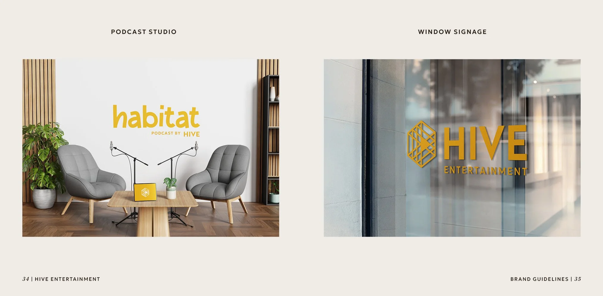
As a result, Hive Entertainment’s branding feels warm, natural, and modern, creating an approachable and refined experience. The color palette is built around natural yellows and browns, and the typography combines the geometric sans serif Geologica with the classic serif typeface Kepler. Throughout brand extensions, photography is natural, inspirational, and personable.

Design Solution